CatchIt Mobile Prospect App
CatchIt is a unique CRM database app that helps sales representatives organize and track potential prospects. There was a lot of research involved in the project since it was a unique app that mainly targets business professionals as users.
Project Overview
Since the main users for this product are busy sales and account managers, it had to be a very quick and easy to use app. A lot of the design is based on simplicity with the user in mind.
We lessened the number of steps a user can take when logging a potential prospect in the app. It was an interesting hands-on experience designing the concept, wireframing and prototyping the product.
Logo Development
The logo development for the app was effortless as the company already had an idea of the look and feel. I was advised to create something simple, clean and easy to identify. The symbol represents the letter “C” for CatchIt.
It started out with a simple typography and then it was outlined as a vector to create the sharp edges using the pen tool. The symbol was later changed to a softer and rounder edge to symbolize a softer “C” and a boomerang.
Stage #1
Stage #2
Stage #3
Stage #4
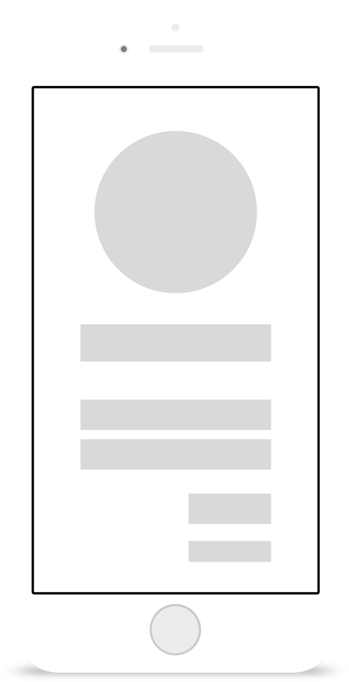
App Wireframes
Login
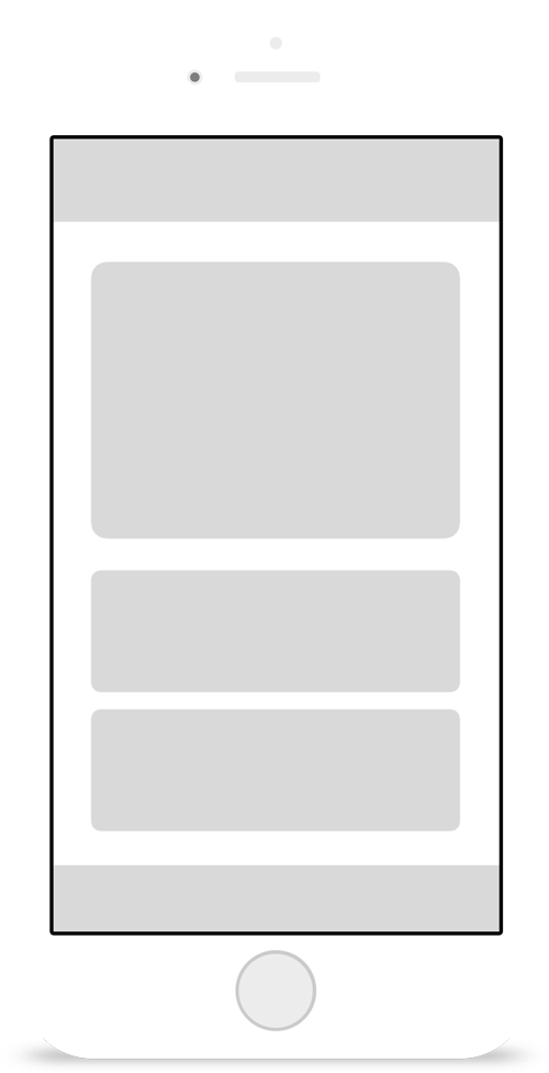
Calendar
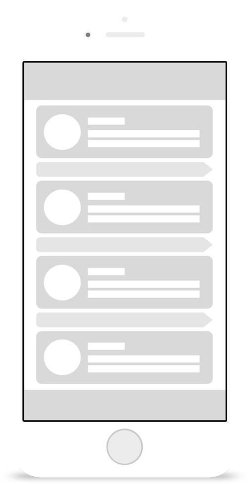
Prospect
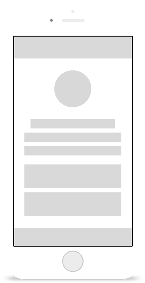
Profile
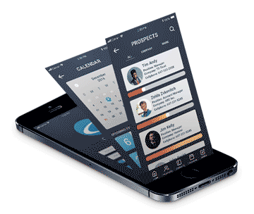
iOS Mockup & Prototype
Since the colour scheme was already identified throughout the branding and logo process, laying it out on the app was simple.
I designed a hi-fi iOS mockups, shown below are the login, calendar, prospects and profile screens. Using the prototyping tool Principle, I exported the artboards from Sketch and made it interactive to showcase the ocular functionality of the app.

Android Mockup & Prototype
I also prototyped the app for Android, the device used for showcasing the interactivity is the Google Pixel 2.
This example shows how the prospect’s information is shown in the card but if swiped to the right individual phone numbers will appear. Further swiping right, if the user wanted to call the prospect’s office number they can easily tap on the number for an quick call.

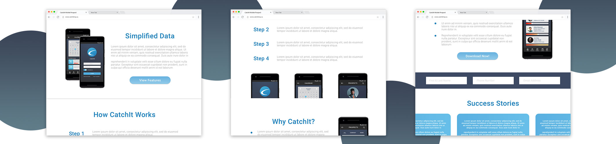
Website Wireframes
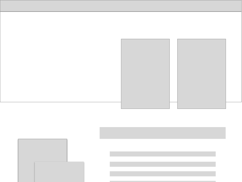


Using Adobe XD, I designed the wireframes for the website. I added the rectanglar boxes to place my images and text. I based the wireframe with user in mind, putting myself in their situation. “If I were a sales representative what information would I wanna know first?”, “What is this app?”, “How will this app benefit me?” and etc.
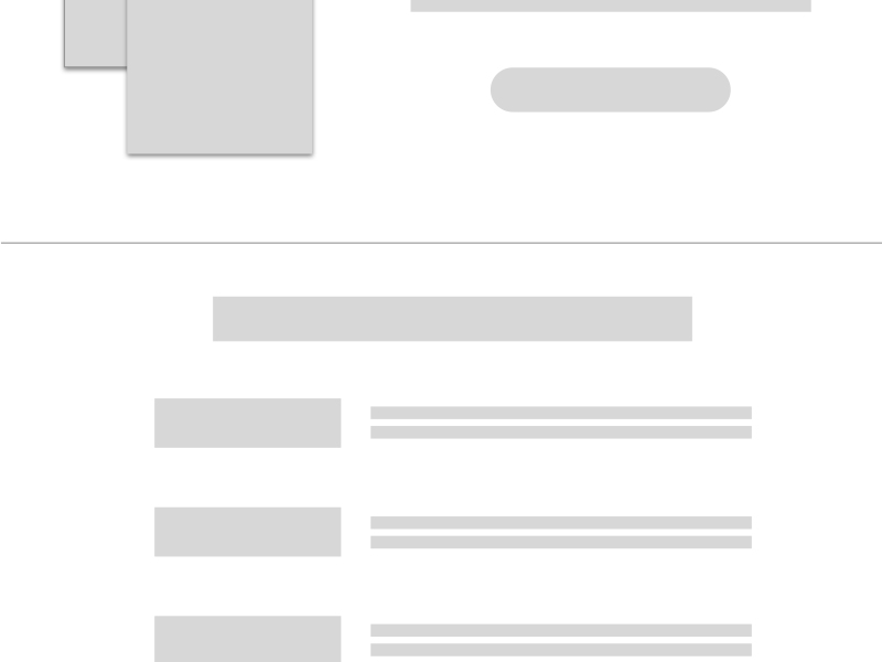
Website Mockup
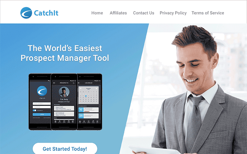
Moving to the mockup, I embraced the white space and utilized it to my advantage. Too much information and images will create a cluster and confuse future web visitors. I designed a clean website with structured text and images to help visitors identify what the product is offering. It also identifies the benefits, core features and steps to ease the reading.